Designing for the 'Oops, what's wrong?'⚠️
One of the early problems that I helped solve for Perk Payroll was handling errors. We've had our users tell us about their escapades into the eerie, unknown territories of error situations filled with technical jargon and how they despised it.
Our support tickets kept rising for error-related queries which otherwise, with proper preventions and error messages would have been handled by the user.
These situations had a business impact too! A significant amount of time from the customer support team was tied with solving, and addressing these errors that could have been prevented in the first place.
How might we reduce user dilemmas during moments of failure and give them a clear way ahead?


Improvising the inevitable
We had to act, now.
We needed a list of possible definite errors that a user might face in unfortunate cases of slips or mistakes.
Errors that are slips or mistakes
A typical accidental interaction or a mismatch between system and user, we have had both instances. Especially, reports that took longer to run and ended in error due to server issues.
Error prevention
The buttons 'Choose File' and 'Upload'
are improperly placed, almost together.
Empty states
Empty states are moments in a user’s experience where there is nothing to display. No search results, new user onboarding, and user-cleared records were our highest marks in the category.
"The greatest mistake is to imagine that we never err."
-Thomas Carlyle
Decoding Errors
We pooled a lot of data, from customer support records, and the error logs from the tech team, We've recorded support interactions when users faced errors.
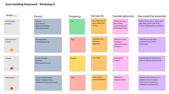
Once we had enough data, we conducted a brainstorming session with the customer support team, product manager, and the dev team over a period of two weeks. With both groups' expertise, we mapped errors with their causes, scope to fix (by user), scope for prevention and possible redirections.
We realised the chances of empty states were higher than ever as we were onboarding clients at an increasing rate and all of them are going to stare at bare walls before they get their data imported. Evidently, we were at risk of user abandonment in the first few days of onboarding due to shallow user experience. Fixing this was now an equally business goal.

Visual Design
Please get in touch with me to see the hi-fi designs. The good old NDA.
We spent two weeks mapping errors and tracking live support calls. I simultaneously started drafting visual designs while dabbling around and drawing inspiration from Netflix, Spotify and other B2C apps initially, wishing we could have something more creative but balanced enough for a payroll app!